CHIA
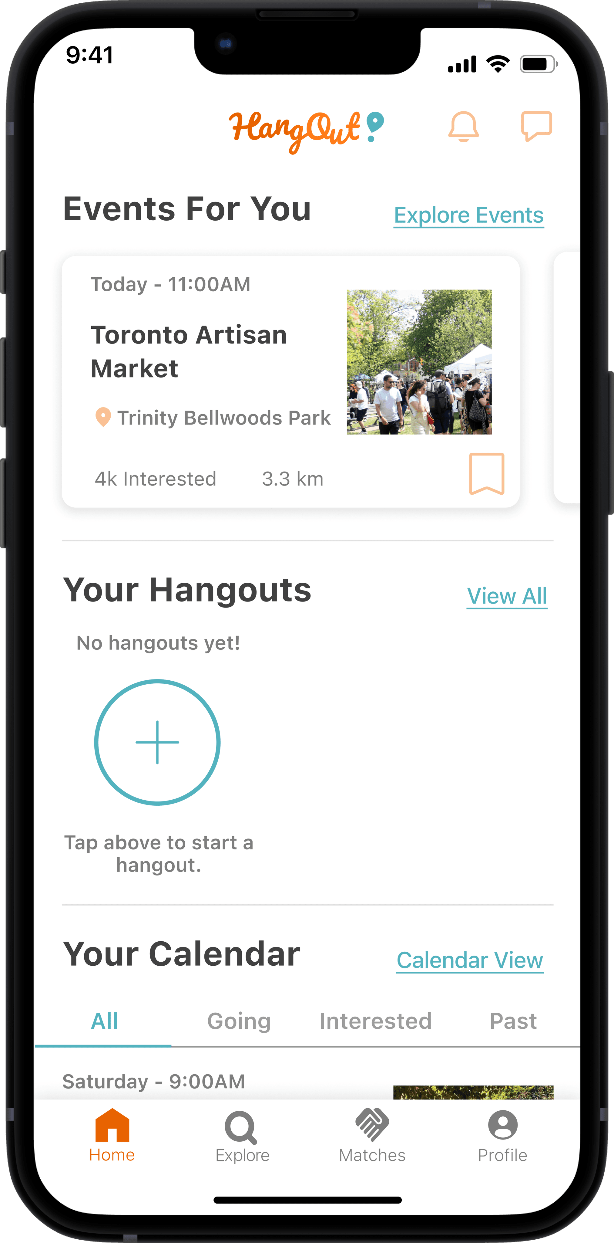
The Canadian Healthcare Industry Awards is an event held by Catalytic Health to recognize the best and brightest in the Canadian healthcare industry. I designed and developed a responsive WordPress website for the event.
Overview
Client
Catalytic Health
Role
UX/UI Designer
Team
1-Person team
Platform
Desktop
Duration
8 weeks (2023)
The Story
This was my first professional design experience post-bootcamp. I was a bit nervous as the sole designer/developer on the project, but I had a great, collaborative Project Manager and I was excited to put my skills to the test.
Project Brief
Catalytic Health brought me on as the sole Web Designer/Developer to create a responsive WordPress website for the inaugural edition of their Canadian Healthcare Industry Awards night. The requirements were 7 pages (Landing, About, Host, Jury, Award Categories, Event Details, FAQ) and JotForms that would integrate with the site.
The Process
✏️
Requirements & Wireframes
I spent a week prior to the official start of the project learning WordPress to gauge what was technically feasible for me to execute. I gathered requirements from the client and created hi-fid wireframes for feedback.
🤝
Feedback & Development
After driving a feedback session, I iterated on the wireframes, got approval to begin development, and built out the pages in WordPress.
💎
Refine & Launch
The client provided new feedback and direction, which I applied to the site. I integrated JotForms, made some minor tweaks, and then the site went live.
✏️
Requirements & Design
I taught myself WordPress in 1 week prior to the client kick-off call and was sent the following requirements ahead of the call.
3
main requirements:
Information about the awards
Award nomination forms
A registration form for attendees
7
pages for information:
Landing page
About page
Event Location & Agenda page
Host Page
Award Categories & Criteria page
Nominees page
FAQ page
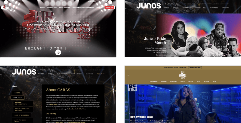
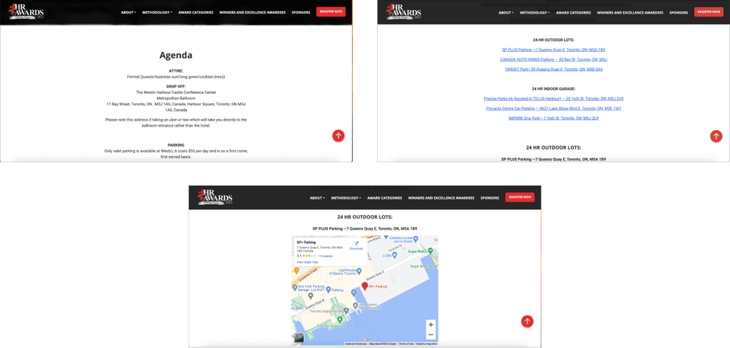
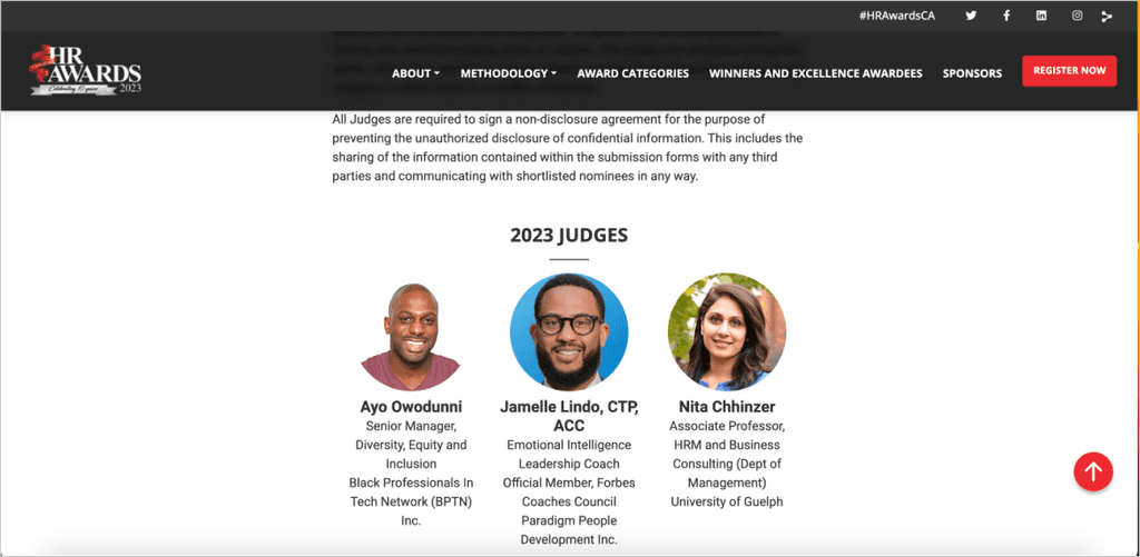
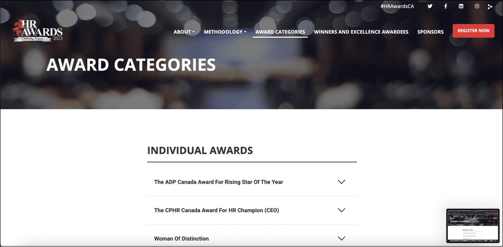
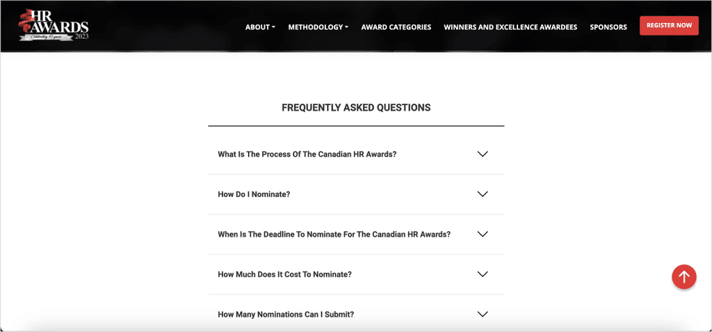
I made a quick Inspiration Board, mostly based on one other similar site.
Hero Section
Event Info
Judges
Award Caetegories
FAQ
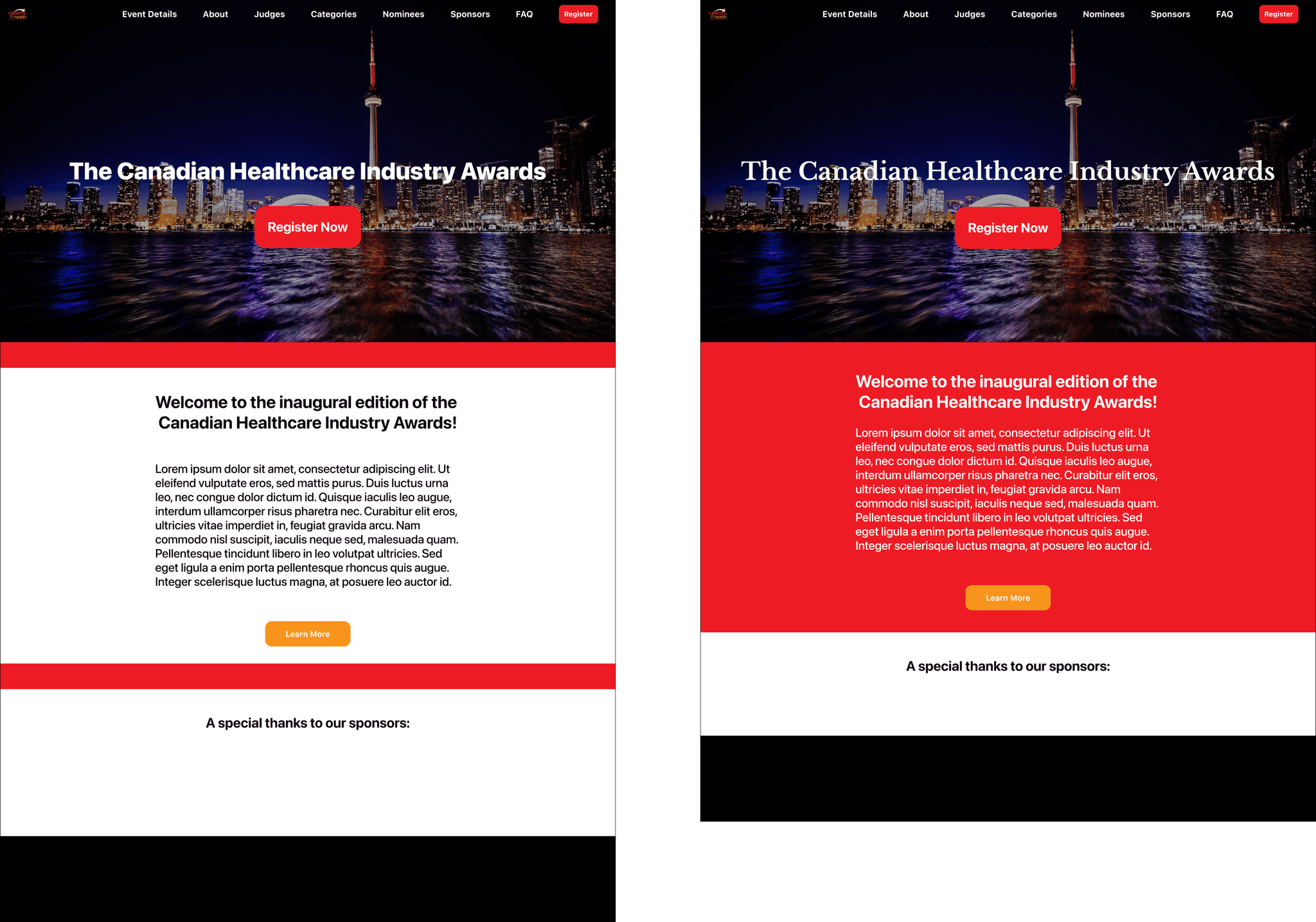
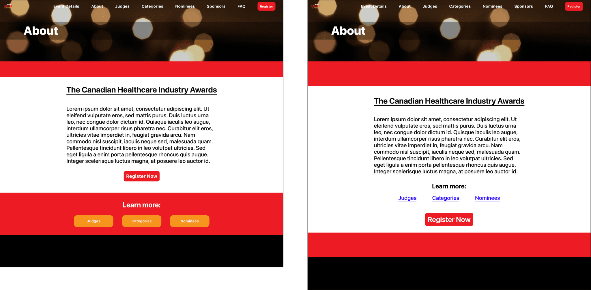
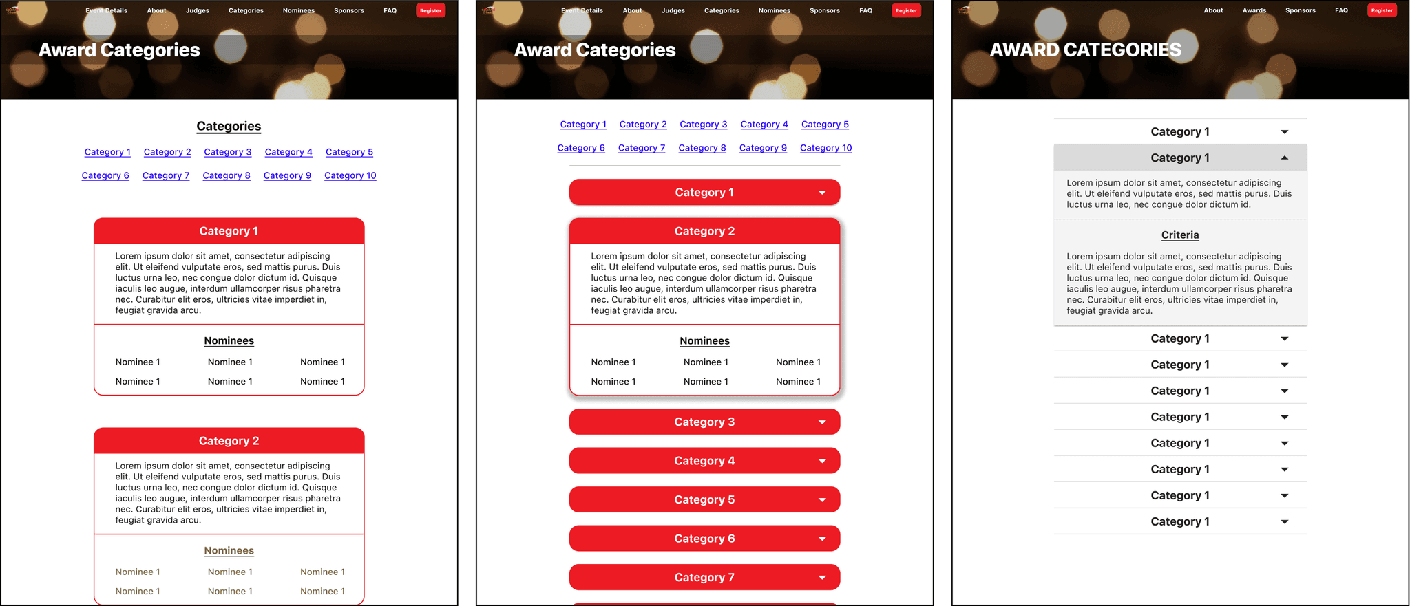
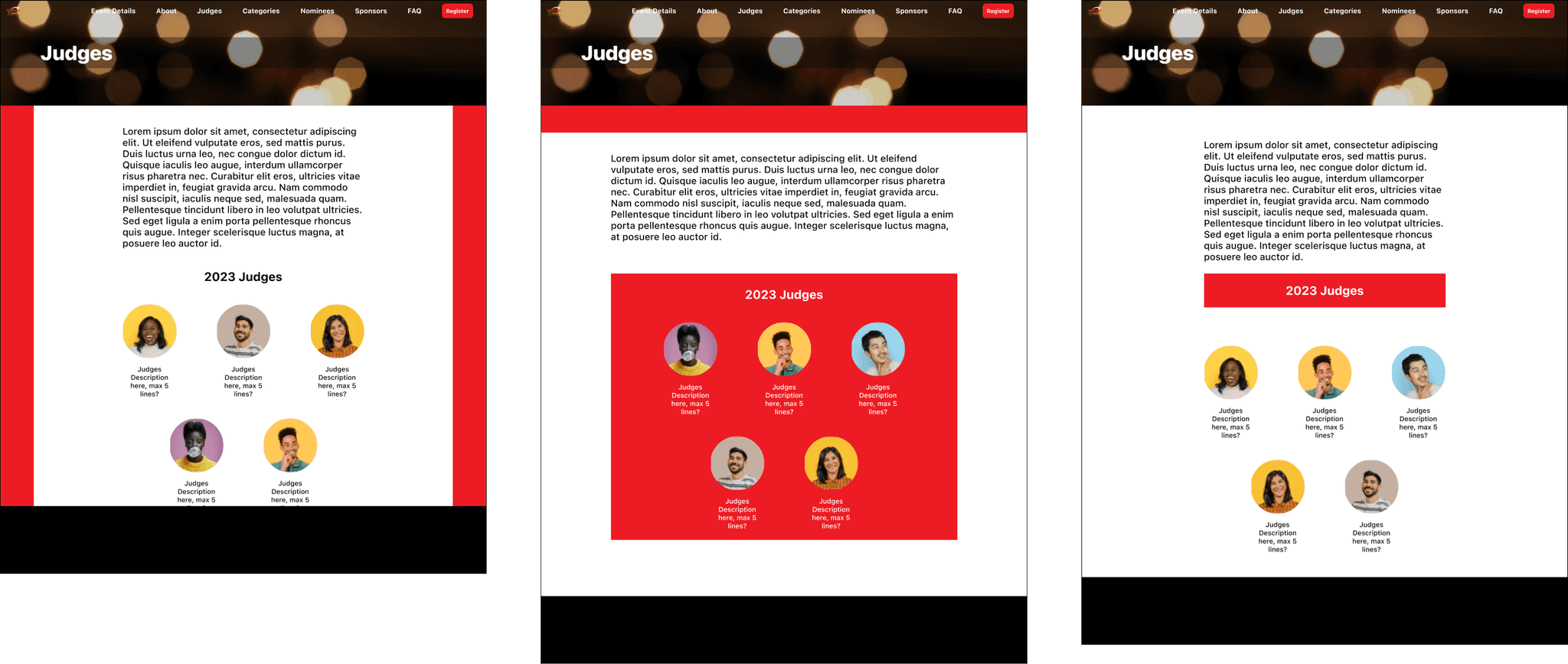
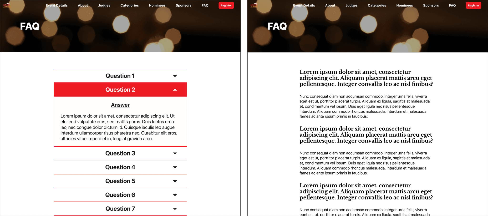
I then developed initial Hi-Fidelity variations of some pages to present during the kick-off call for quick feedback, keeping in mind Catalytic Health's brand colours (including #ED1C24 and #F7941D).
Landing Page
About
Categories
Judges
FAQ
🤝
Feedback & Development
Our kick-off call provided 2 main pieces of feedback.
Landing Page
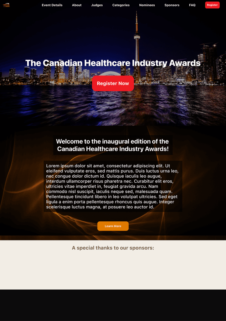
About
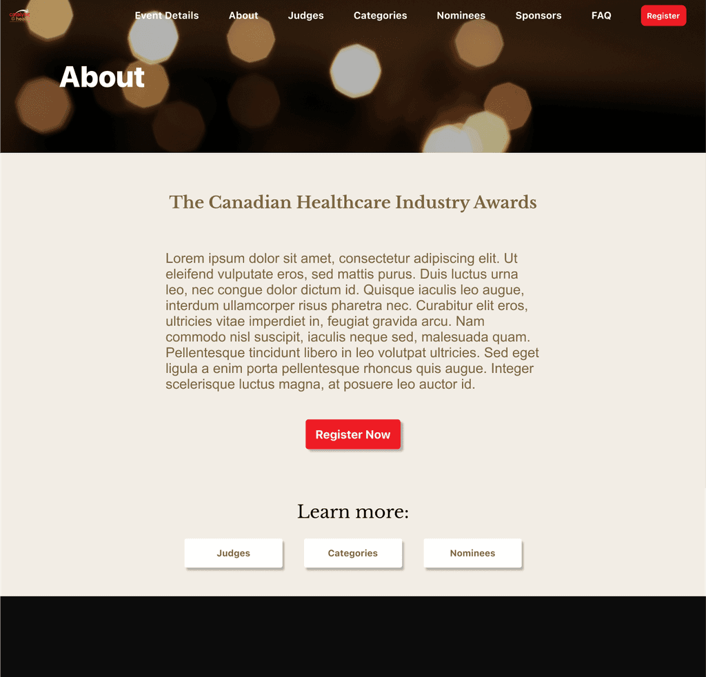
Categories
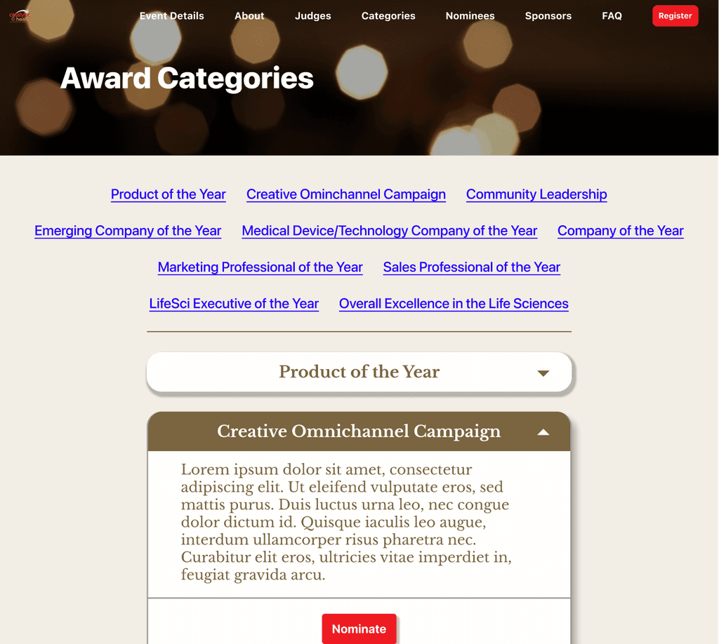
Judges
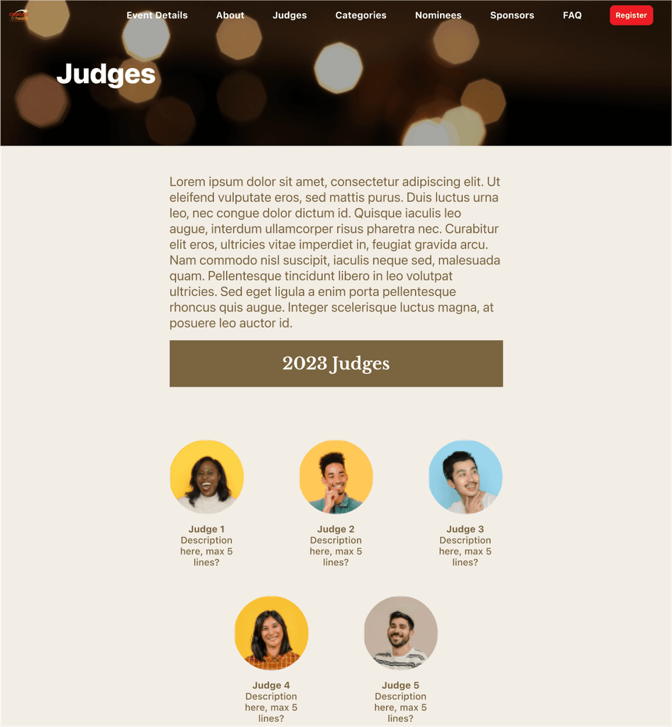
FAQ
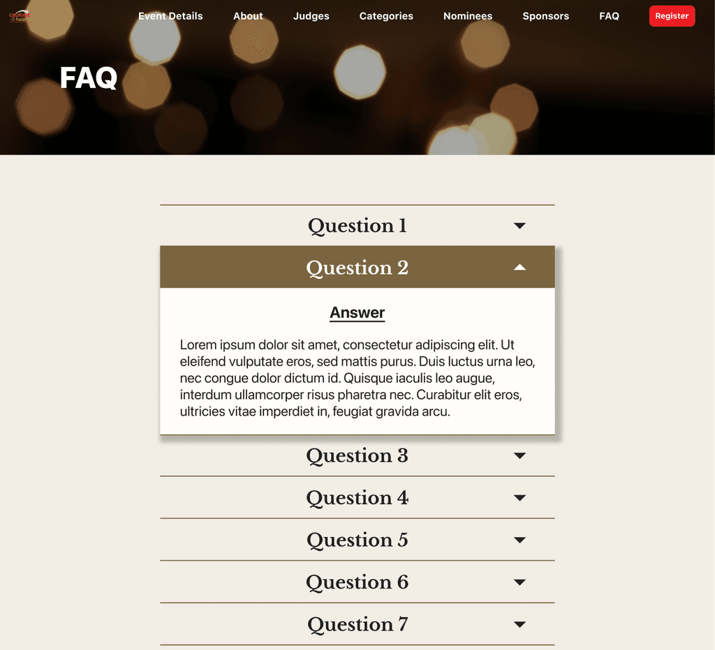
My Project Manager approved beginning development so I got to work.
💎
Refine & Launch
I presented the site to Catalytic Health's President & Managing Director, as well as their Senior VP of strategy, and while they liked the direction the site was going in, they provided the following feedback:
I took this feedback and redesigned directly in WordPress to create the final screens.
During this process, I was in constant communication with my Project Manager, sending her samples of what I was working on and making changes based on her input and direction.
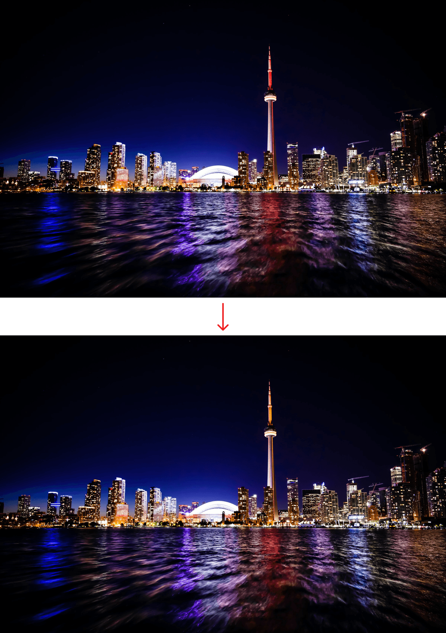
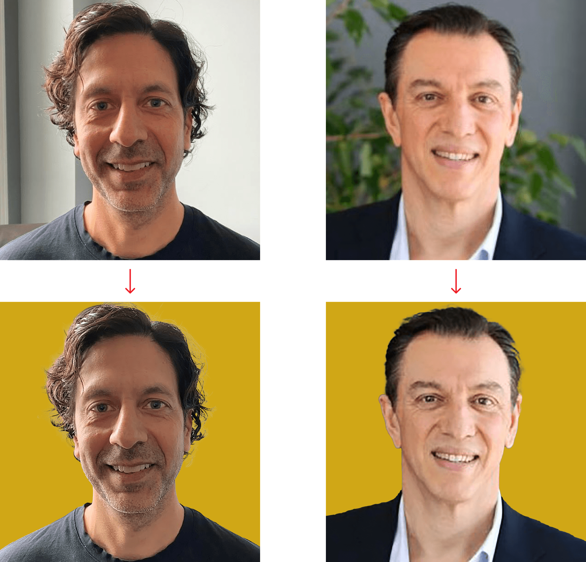
Throughout this process, I received the copy and assets needed for the site, and in order to make everything consistent, I used photoshop to change the lighting in the hero section image and all of the headshot backgrounds to gold. I made most of the buttons gold as well, except for the main "Reserve a Table" and "Nominate" CTAs, which I kept Catalytic Healths' red.
I also made sure the site was responsive and worked across devices, as can be seen from the demo videos below.
💻
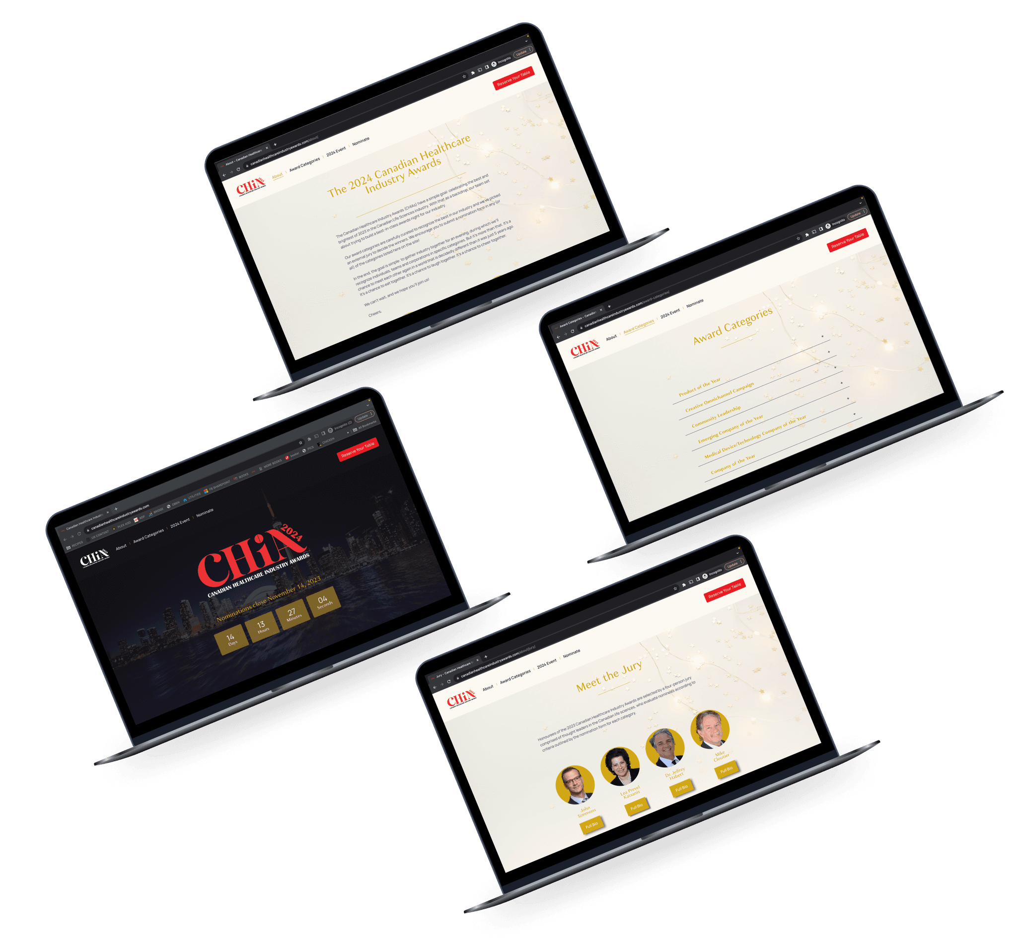
Final Screens
Features:
Countdown to when nominations close to create urgency
Users can also click the countdown to navigate to Award Categories page to nominate
Mid-screen navigation to encourage users to explore the rest of the website
Main CTA (reserve your table) always accessible through top nav bar
Host, Jury and FAQ page are nested under About in top nav bar
Features:
Letter from senior team members at Catalytic Health as well as headshots/written signatures as a warm greeting to users
Hyperlinks in text of letter navigate to relevant pages
"Learn More" section at the bottom allows users to navigate to pages nested in About section in top nav bar and makes it easy for users to explore the site
Features:
"Learn More" section at the bottom allows users to navigate to pages nested in About section in top nav bar and makes it easy for users to explore the site
Features:
Pop-ups that allow users to read each jury member's full biography
"Learn More" section at the bottom allows users to navigate to pages nested in About section in top nav bar and makes it easy for users to explore the site
Features:
Content accordian that allows users to get a quick overview of questions and obtain answers to specific questions without overloading them with unnecessary/unwanted text/information
"Learn More" section at the bottom allows users to navigate to pages nested in About section in top nav bar and makes it easy for users to explore the site
Features:
Content accordian that allows uers to quickly see the award categories and click into them to get more details
Each category also contains a Nominate button that navigates users to a category-specific JotForm used to submit nominations
Features:
Hyperlink in details that navigates to the About page so users can learn more about the awards
Interactive map showing the location of the event
Features:
We integrated award category-specific JotForms to allow users to submit nominations for the different awards
JotForms can be accessed directly from the top nav bar (in the Nomination dropdown) or from the Award Categories page
Features:
We integrated a JotForm to allow users to reserve tables for the event
This was deemed as the most important action, so the CTA leading to the JotForm is located in the top nav bar and can be accessed from every page in the site
Takeaways
Key Learnings
When I learned I had been hired for the job, I had about two weeks before the kick-off meeting with the team. In the first week, I watched a lot of tutorials and did a couple of online courses to prepare for the role, building a couple of dummy websites. Over the course of the project, I learned a lot from my Project Manager, who had experience building WordPress websites. Overall, I'm proud of the work I accomplished and I'm excited to have another skill in my toolbelt.
This was my first professional experience as a Designer, designing to specific requirements, and collaborating with stakeholders and a team. I gained valuable experience meeting tight deadlines and implementing feedback and direction from an actual client. I also got to practice communicating effectively with my Project Manager, asking for feedback when needed to create a polished product.
What Would I Do Differently?
If I had the time and permission, I would've loved to test the website with a few users to see where improvements could be made in terms of emotional experience, clarity, and navigation.
I would love to learn CSS and JavaScript so I can customize features and functionalities for future websites in interesting and delightful ways, and not be as limited by my technical capabilities.
Since this was my first professional project and it also required learning a whole new platform, I was a bit nervous. I adhered to the client's requirements and requests as best I could, but wasn't as vocal with my own suggestions as I should've been, especially with making sure the fonts and colours passed Accessibility guidelines. I'm excited to move into my next professional project - to champion the users more, contribute meaningfully, and show my confidence as a designer.
